
Site migration & redesign
Company: The Tile Shop
Role: UX/UI Designer
Tools: XD, Lucidchart

Process
〰️
Process 〰️
01.
Overview
Tileshop.com was being migrated to a responsive platform, and the UI didn’t align with new-and-improved branding – a complete redesign was necessary. And while we were at it, why not overhaul the sitemap? The timeline: 6 months. 😅
I worked closely with leadership, merchandising, marketing/creative, development, SEO, QA, and a project manager to go live with the new site on-schedule in 2019.
My deliverables as the sole UX/UI designer:
Sitemap and navigation
Web style guide
Flexible, re-usable component designs
Fully responsive page template designs
02.
Pain points & opportunities
Legacy tileshop.com was not responsive and heavily used images with baked in text + CTAs – this was neither user-friendly or accessible.
Additionally, the sitemap + navigation were not intuitive and needed to be re-organized. Categories like “Shop by color” were non-existent yet had immense SEO value.
Legacy header navigation
❌ Missing “All” pages/links
❌ Can’t browse Material or Room sub-categories via nav
❌ Tile should have more prominence than finishing pieces and installation
❌ Unnecessary duplication of new arrivals
Legacy footer navigation
❌ Too much content – repetitive of nav and difficult to scan
❌ Customer service links not prominent enough
Legacy home page
❌ Text and CTAs embedded in images
❌ Lack of clear visual hierarchy
❌ Inconsistent text styles
Legacy product list page
❌ Not enough products visible per page
❌ Lack of SEO text
❌ Minimal filter options
Legacy product detail page
❌ Outdated UI
❌ Confusing symbols
❌ Lack of inspirational imagery
03.
Sitemap & navigation
I conducted a card sorting exercise with the merchandising team, completed a competitive analysis, and worked with our SEO specialist to implement the following:
Top-level page was updated to simply “Shop” – Tile, Finishing pieces, and Installation & Care moved under it. This helped de-clutter the navigation and gave Tile more prominence.
Under Tile, we inverted the hierarchy so that instead of leading with application (i.e. floor and wall), we led with rooms (kitchen, bathroom, etc.) and material (marble, ceramic, etc.). This aligned more closely with how our customers approached shopping for tile, and made it easier for merchandising to cross-sell on PLPs.
Added new categories: Color, Style, Shape
Added “Shop all …” CTAs
New sitemap
✅ Clearer hierarchy + elimination of dupes
✅ New, SEO optimized categories
✅ This visual artifact greatly helped keep the migration on track
New header navigation
✅ Clearer hierarchy with breadth of assortment easier to understand
✅ Easy to quickly narrow down via additional sub-categories
✅ Clickable category headers
✅ Shop all CTA
New footer navigation
✅ De-cluttered and easier to scan
✅ Customer Service more prominent
04.
Web style guide
The agency who led the rebrand provided a brand book with guidelines and design ideas, but we still needed a web style guide to drive the full site re-design. I focused on type styles, colors, buttons, iconography, and accessibility as a foundation for components and page templates.
Note: A grayscale color scheme was chosen to reflect The Tile Shop’s most popular tile – Italian marble – and let the photography shine. Accent colors were acceptable in marketing campaigns as long as they were color picked from tile featured in the photography.
05.
Components
I designed a library of versatile, re-usable components that were both highly functional and aesthetically pleasing, allowing The Tile Shop to effectively tell product stories via an elevated UI.
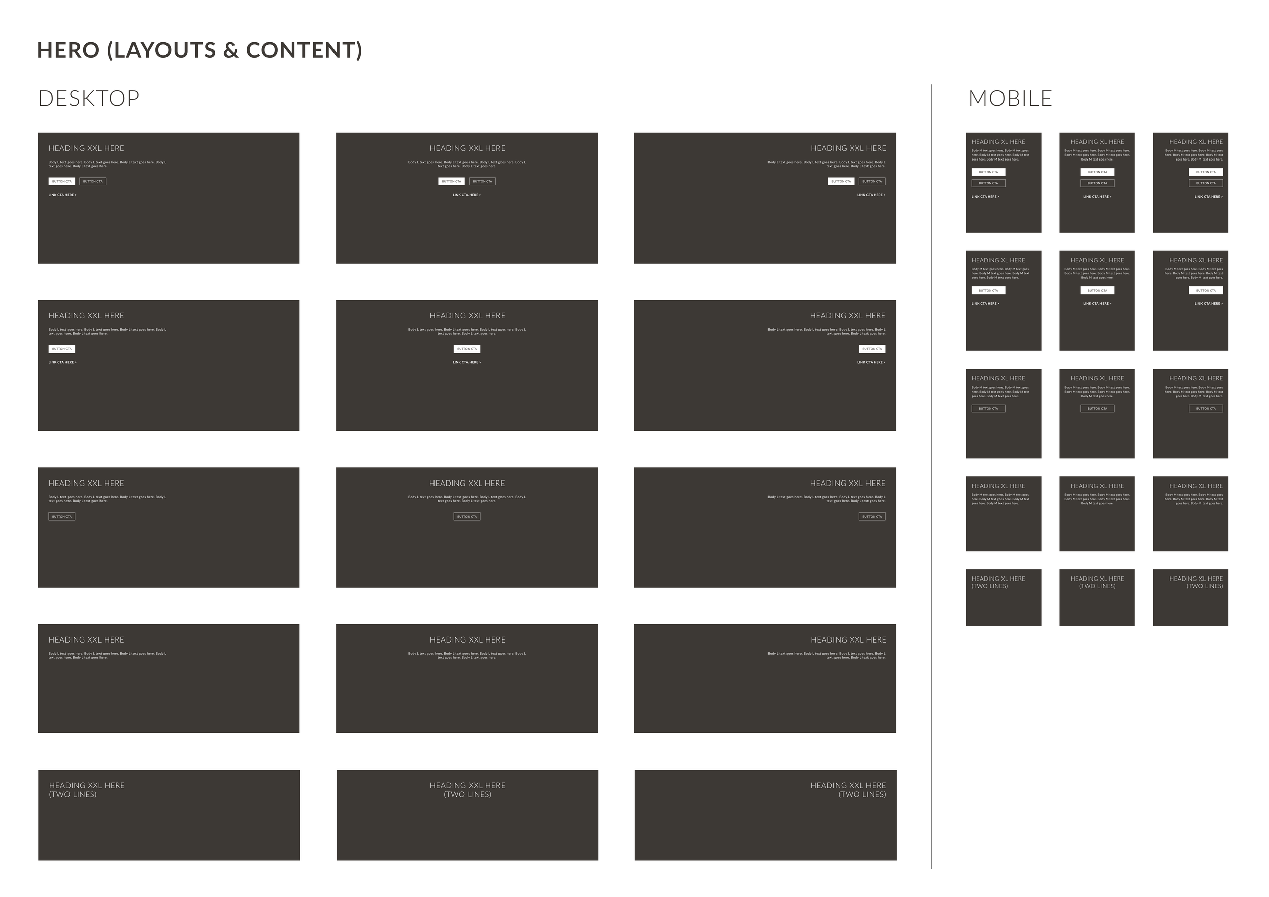
Hero component
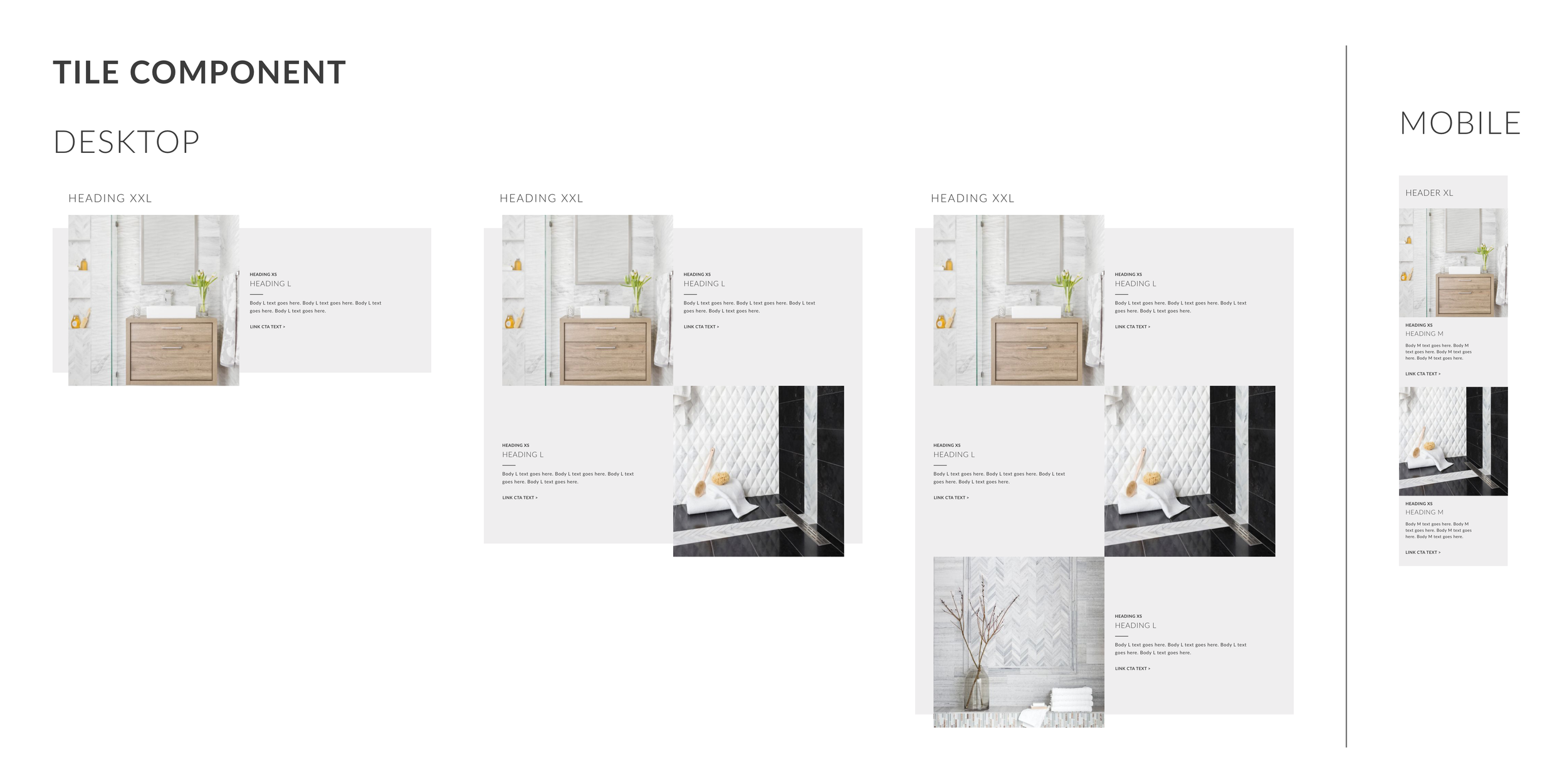
Tile component
3-column component
2-column component
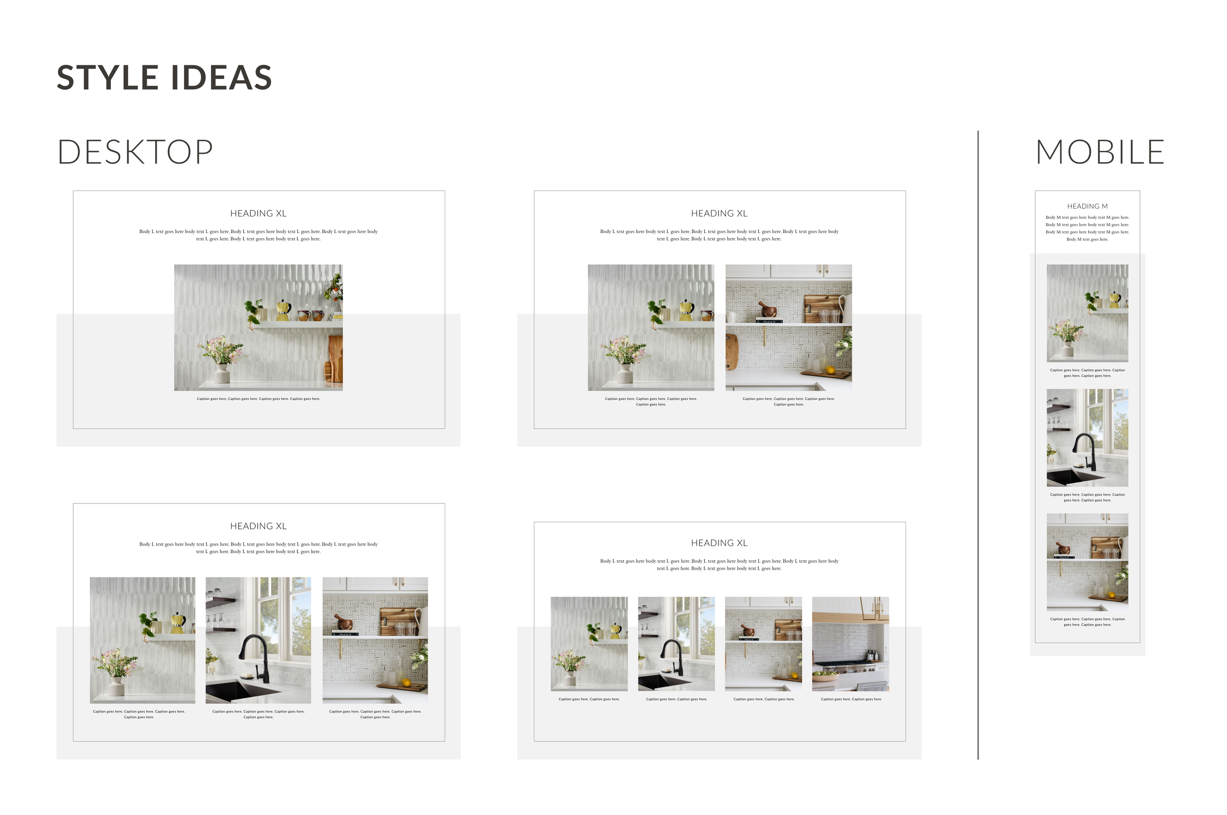
Style ideas component
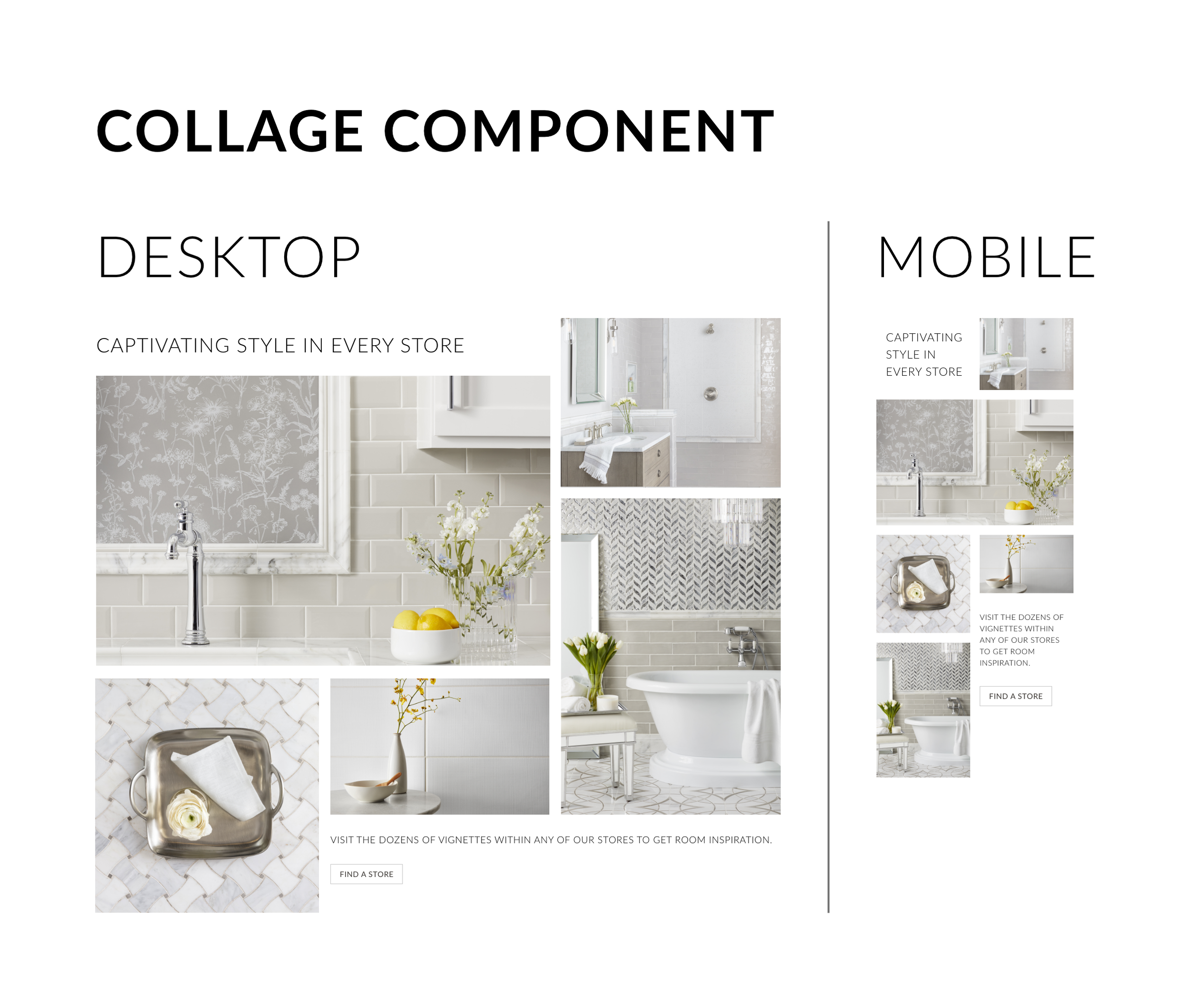
Collage component

06.
Page templates
Finally, I designed responsive page templates, which included additional elements and/or components dedicated to each template.
Home page
Gateway page
Product list page (PLP)
Product detail page (PDP)
Store locator page
Resource & support page
Redesigned home page
✅ Elevated UI
✅ Responsive
✅ Live text and CTAs
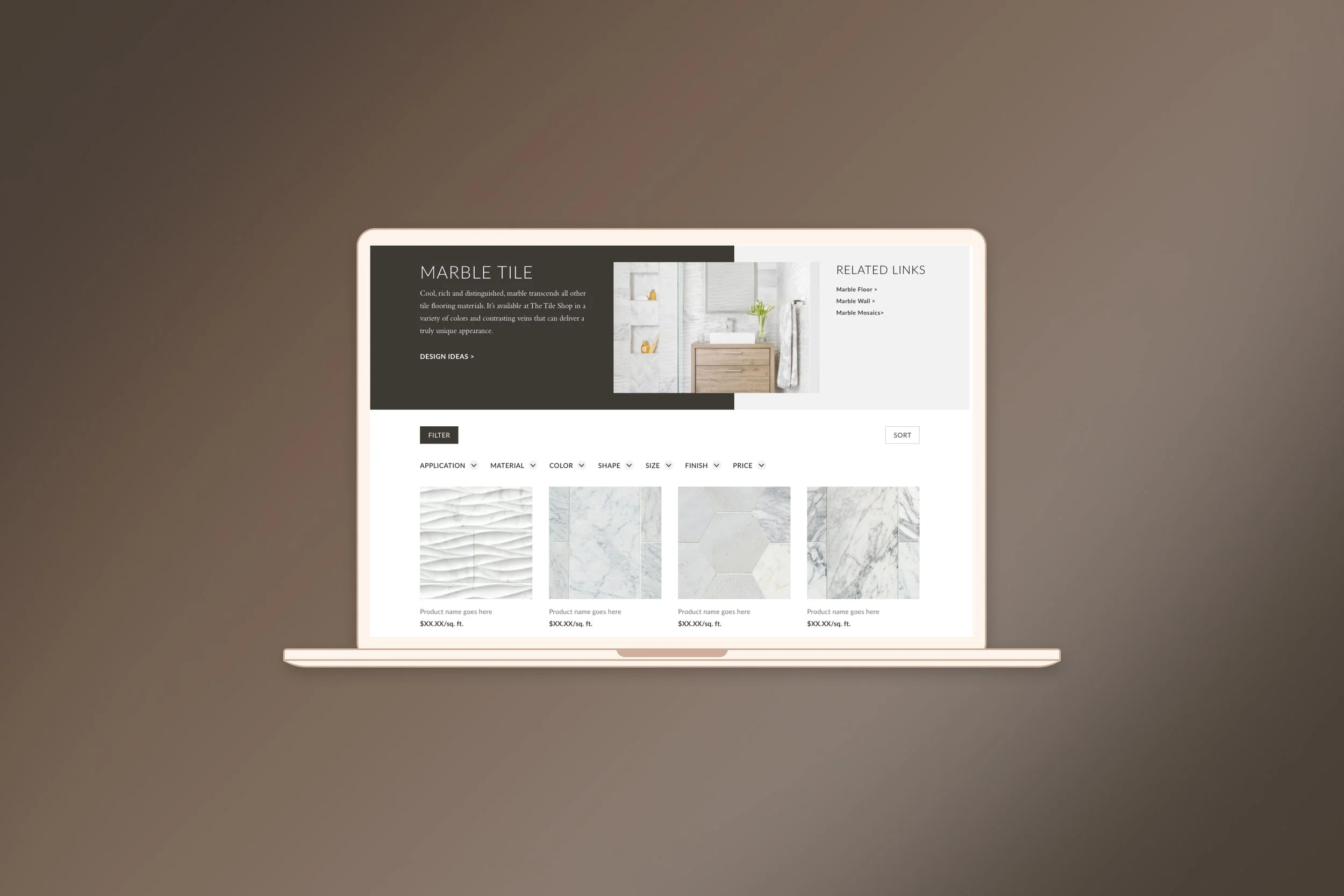
Redesigned product list page
✅ Ability to add links to related categories
✅ SEO text
✅ Full-width design with horizontal filters
✅ Sticky sort/filter on mobile
Redesigned product detail page
✅ Coordinated with Marketing to add new UGC component
✅ Improved layout
Project completed: 2019
