
Product Card UI & Info Hierarchy
Company: West Elm
Role: Senior UX Designer
Tools: Figma


Process
〰️
Process 〰️
01.
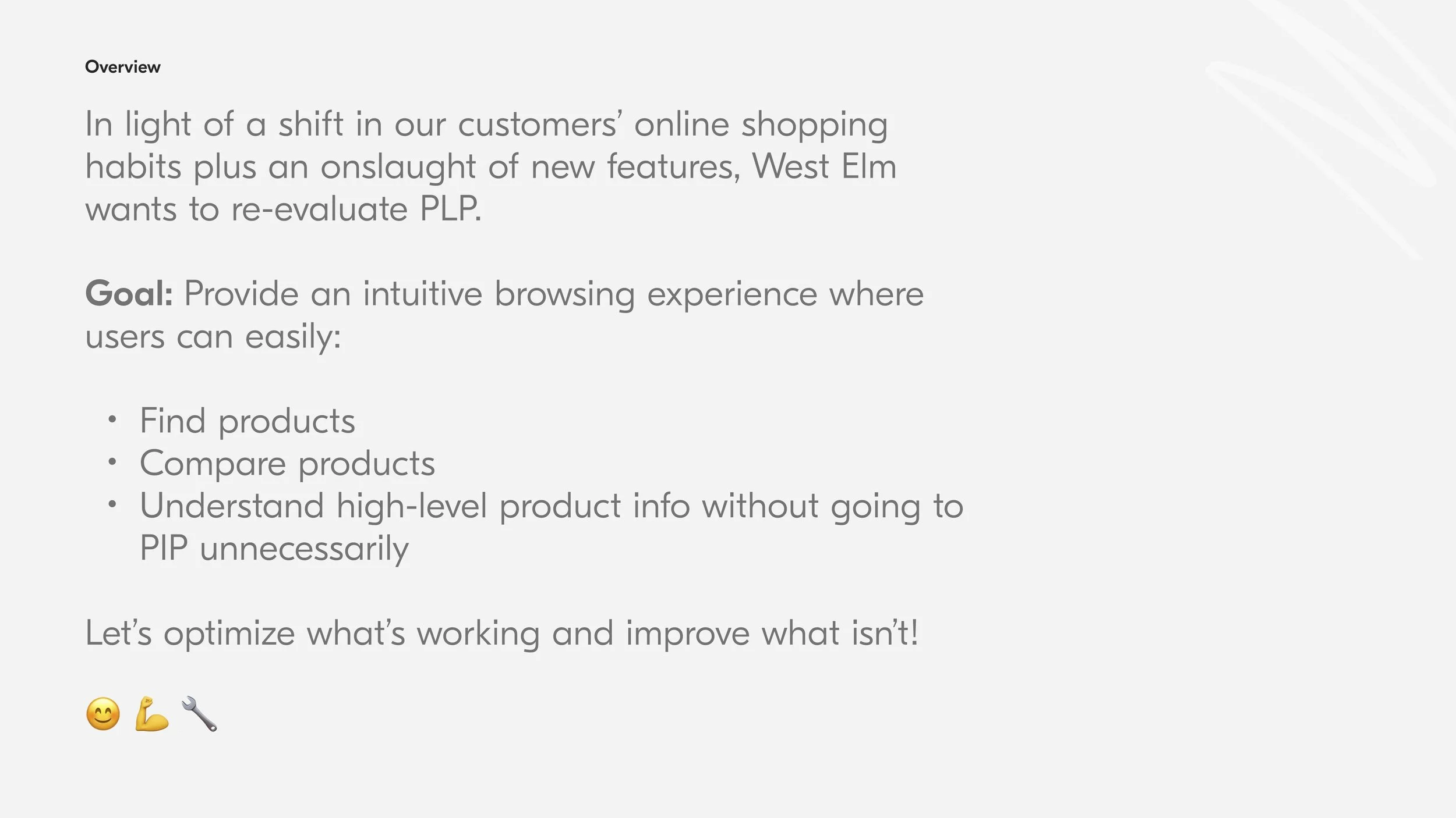
Overview
West Elm’s product cards were untouched for years and felt dated, so the team wanted a UI refresh to improve the look and feel of product list pages. More importantly, product info lacked a clear hierarchy, and it wasn’t easy to quickly scan and compare items.
My UX goals:
Provide an intuitive browsing experience where users can easily find & compare high-level product information
Establish clear visual hierarchy
Consistency: product cards should have the same UI on product list pages and recommendation carousels across web and mobile app
02.
Pain points & opportunities
I audited existing product cards, documenting inconsistencies and points of potential friction:
Unnecessary flags (and too many)
Price difficult to scan and compare, especially sale price
Use of room images and varying angles makes it difficult to compare products
Inconsistent UI and information hierarchy on shop, search, and carousels across web and mobile app
Then, I identified areas of opportunity for improvement:
Standardize placement of favorites heart
Move price up in the hierarchy and make it easier to scan
Clean up and consolidate text styles
Reduce vertical height, especially on mobile web
Audit Findings
❌ Inconsistent UI for swipeable images, favorites heart, and swatches
❌ Inconsistent price display
❌ Inconsistent flag display, with mobile app missing flags altogether
03.
Inspiration
I found that competitors had simple, minimal product cards with a modern aesthetic. They often utilized interactive hover states and quick look to show additional information.
04.
Final designs
In the end, we achieved refreshed product cards with a lot more visual consistency across multiple touch points.
❌ Room image makes it difficult to compare products
❌ Outdated UI – old colors, random font sizes and weights
❌ Unclear price display
❌ Cluttered flags
✅ Improved hierarchy and removed unnecessary info
✅ Simplified UI
✅ Clear price display that aligns with industry standards
✅ Accessible font sizes
✅ Reduced vertical height, especially on mobile


05.
Next steps
Test ultra minimal UI with interactive hover on desktop and quick look on mobile to show additional information.
06.
Broader context
Updating the product card was just one of many enhancement ideas that came out of a broader project to optimize product list pages. View the slide deck below to learn more.
Project completed: 2024
Law of UX:
Cognitive Load: The amount of mental resources needed to understand and interact with an interface.